SPLICE • DESKTOP APP • ONBOARDING
Onboarding for the new Splice desktop app
Creating an onboarding experience that guided new and existing users in the new world.
Wireframe of initial explorations based on common user scenario
> Background
The team has been working on redesigning the desktop app for the past 2 years in order to create a more consistent and seamless experience for our customers.
Now that the app had most of the core features, we wanted to create an onboarding experience that guided users in the new world. Specifically we wanted to properly introduce the new design, the new information architecture and all the amazing things they could do with the new desktop app.
> Research
Before exploring ideas, I dug into previous data and research we had to help form my thinking. There was one glaring issue: asset usage wasn’t where we wanted it to be both in the old and new app.
PROBLEM
Asset usage was low for new users and users do not understand how to navigate their library.
> Process
Since this was the first time we were tackling onboarding for the new desktop app, first, I wanted to take a moment to consider the long term strategy. I stepped back to understand and define the goal for desktop onboarding, what we’ve done in the past, misses from the old app, feedback on the new app and relevant metrics to paint the picture. I also created a few scenarios to understand the user journey, and made rough sketches of what a thoughtful future would look like.
Once I had a rough outline of what we wanted long term, it was easier to come up with creative solutions for onboarding that went beyond the typical coach mark or tooltip.

Wireframe explorations
![3 - Desktop Onboarding Wireframes v2 [Long term] - Base Screen@2x (3).png](https://images.squarespace-cdn.com/content/v1/61e240c437920250b1f13b4a/8c60cede-6972-4aef-8430-00f8c77eca3e/3+-+Desktop+Onboarding+Wireframes+v2+%5BLong+term%5D+-+Base+Screen%402x+%283%29.png)
> Challenges
While I was excited about this onboarding direction, a few things happened internally. Some personnel moved around and we ended up getting a new PM who gave me a much tighter deadline which was our next big release.
Since the highest priority for the team was releasing the actual app, it was important that we kept any proposed solutions small so it required little engineering effort or leveraged external tools such as Braze.
Braze is a tool we used to deliver in-product messages without needing an engineer. Once it was hooked up in our UI, we could experiment at will. With this in mind, I focused my thinking on ideas that could leverage Braze and small ideas that wouldn’t be too difficult to execute.
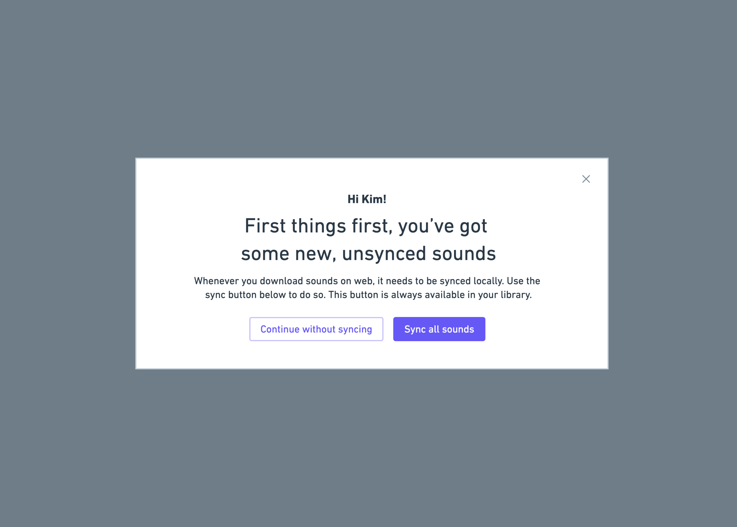
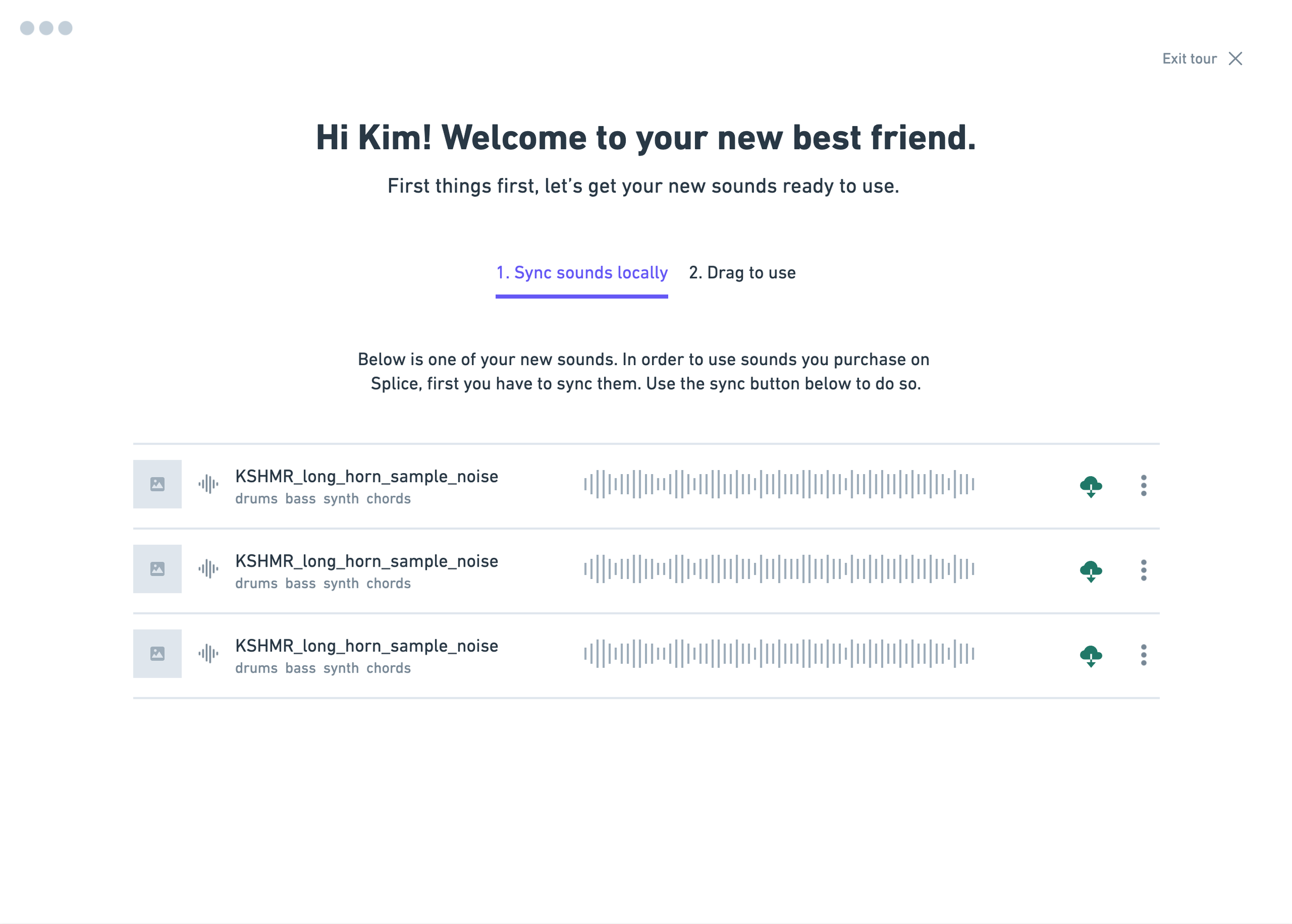
Wireframe explorations for a welcome modal
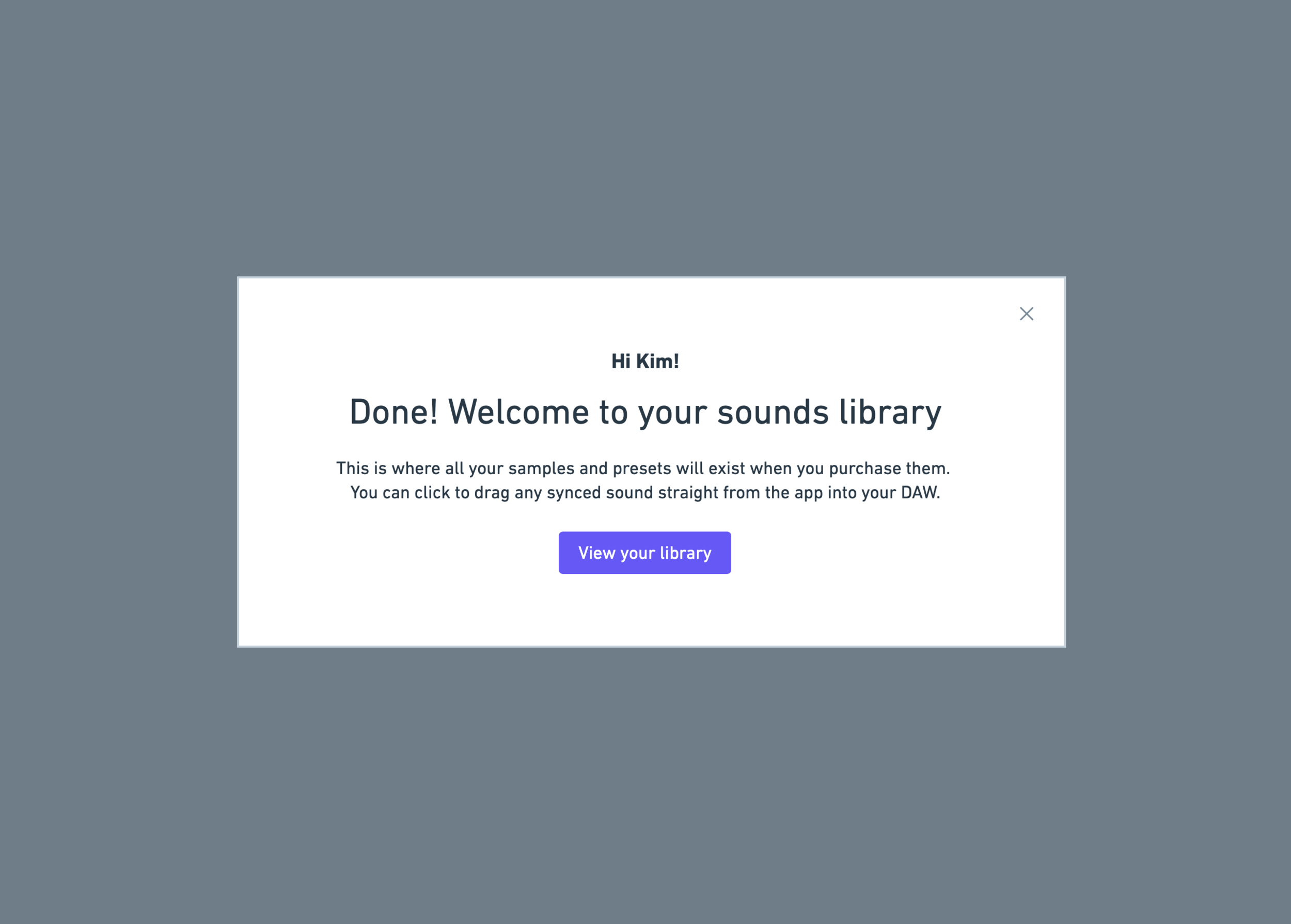
> Iterations
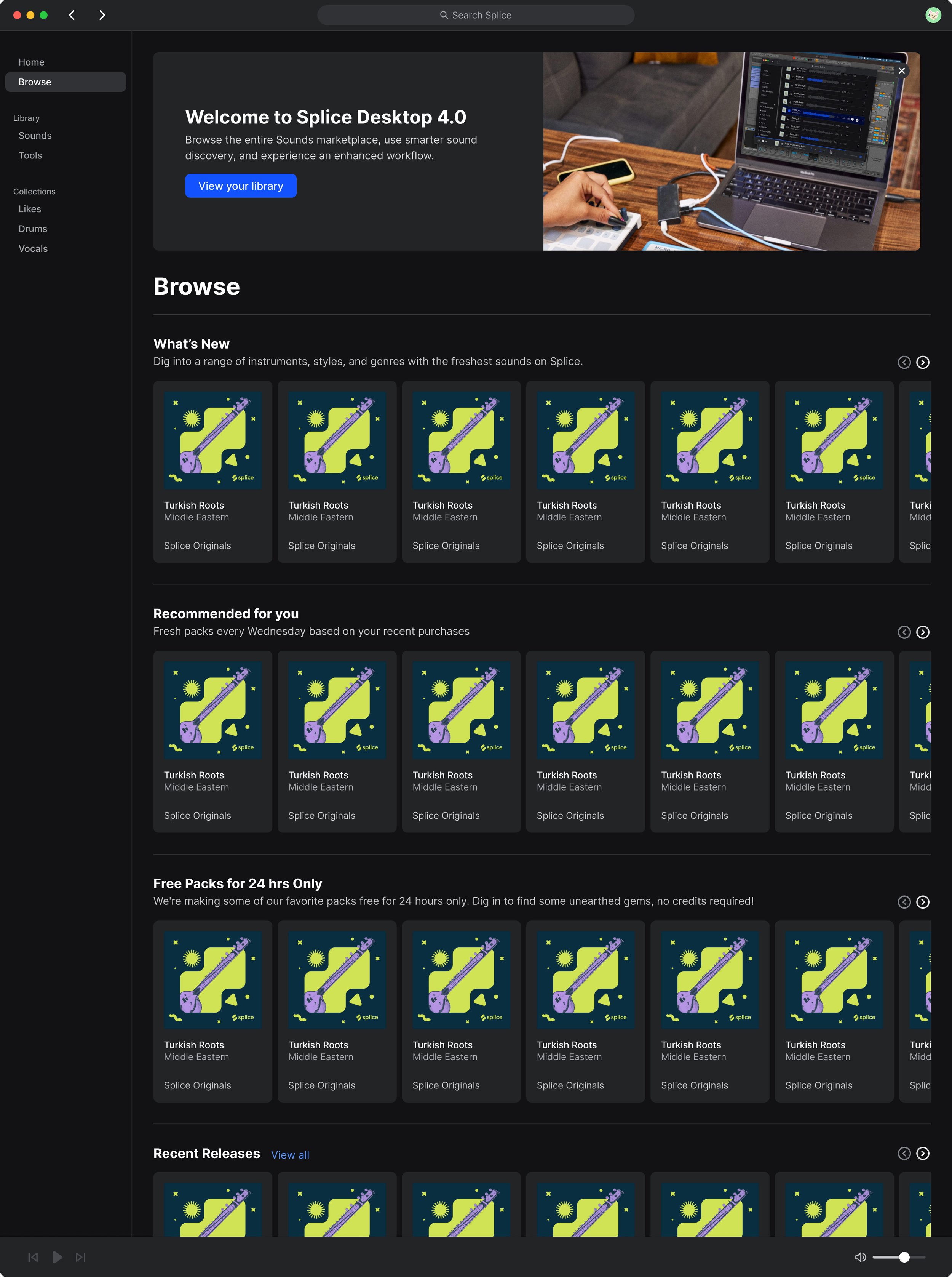
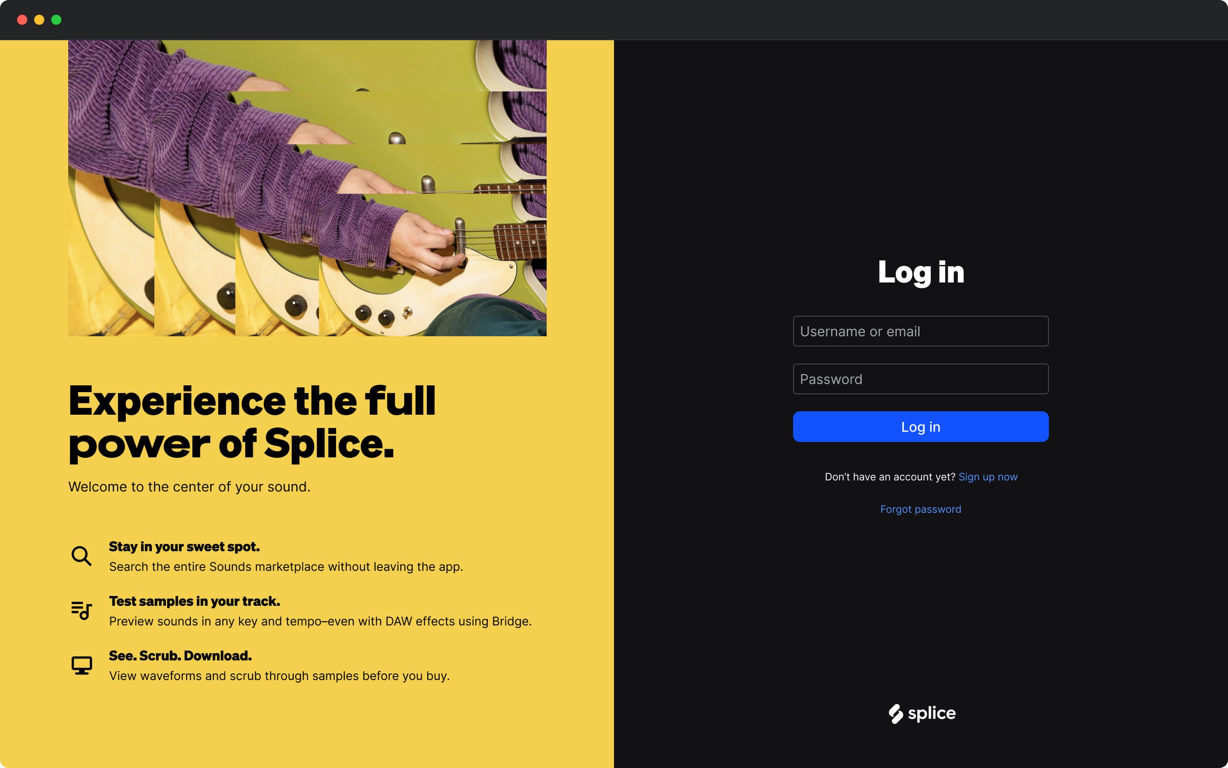
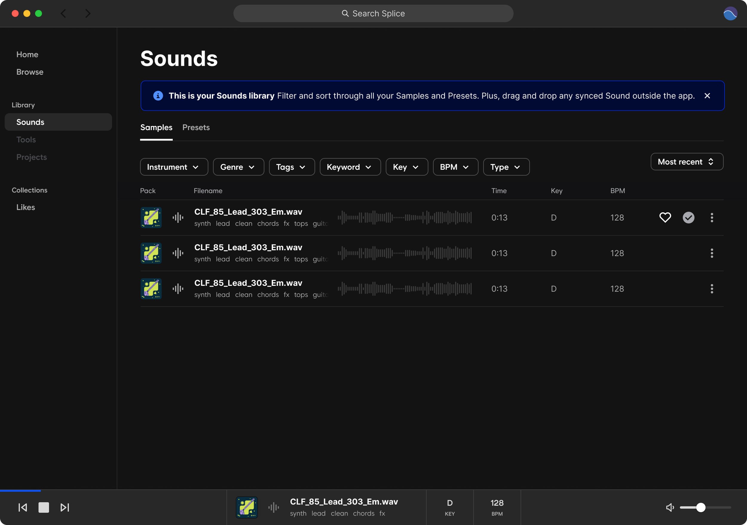
I went through a few iterations to explore different welcome messages, tips and warm starts that would guide a user through the new app. Most of my attention was spent on the first moment they landed into the app and their library because of the feedback on the new desktop app. After a round of design reviews, I landed on a proposal that was reviewed and backed by the design team.
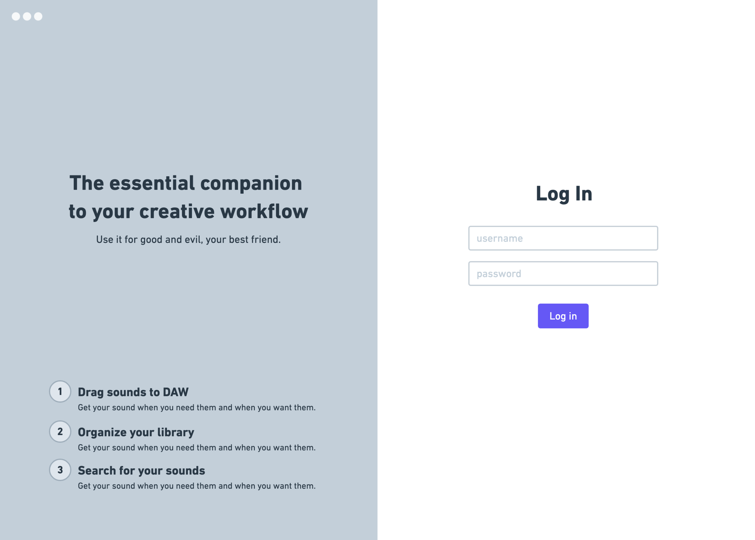
Wireframes for Log in screen

Wireframes for feature banner on Browse
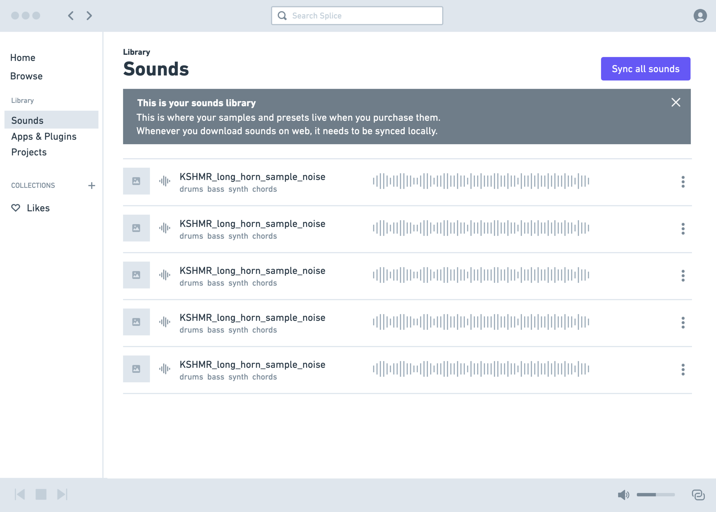
Wireframes for a banner on Library
> Result
I’m happy to say that we were able to tackle almost all of the proposed ideas I presented and some were able to be controlled by Braze. This meant less engineering efforts needed from the team and more control over delivery.
> Impact
Since we just launched these updates recently, we don't have conclusive data we can point to yet but we're excited to see the impact it might have.
The primary metric we’ll be focusing on, to measure the impact of these updates, will be asset usage during a user session since that’s the key action we want to be driving.
> Core Team
PRODUCT DESIGNER
Kim
PRODUCT MANAGER(S)
Tim, Tracy
ENGINEER(S)
Lara, James, Win
> XFN Team
LIFECYCLE MARKETING
Johnny
BRAND/CREATIVE
Simone, Eric