ANGI • WEB • HOMEPAGE
Redesigning the Angi Homepage
Creating a holistic strategy and vision for the homepage to better serve our customers.
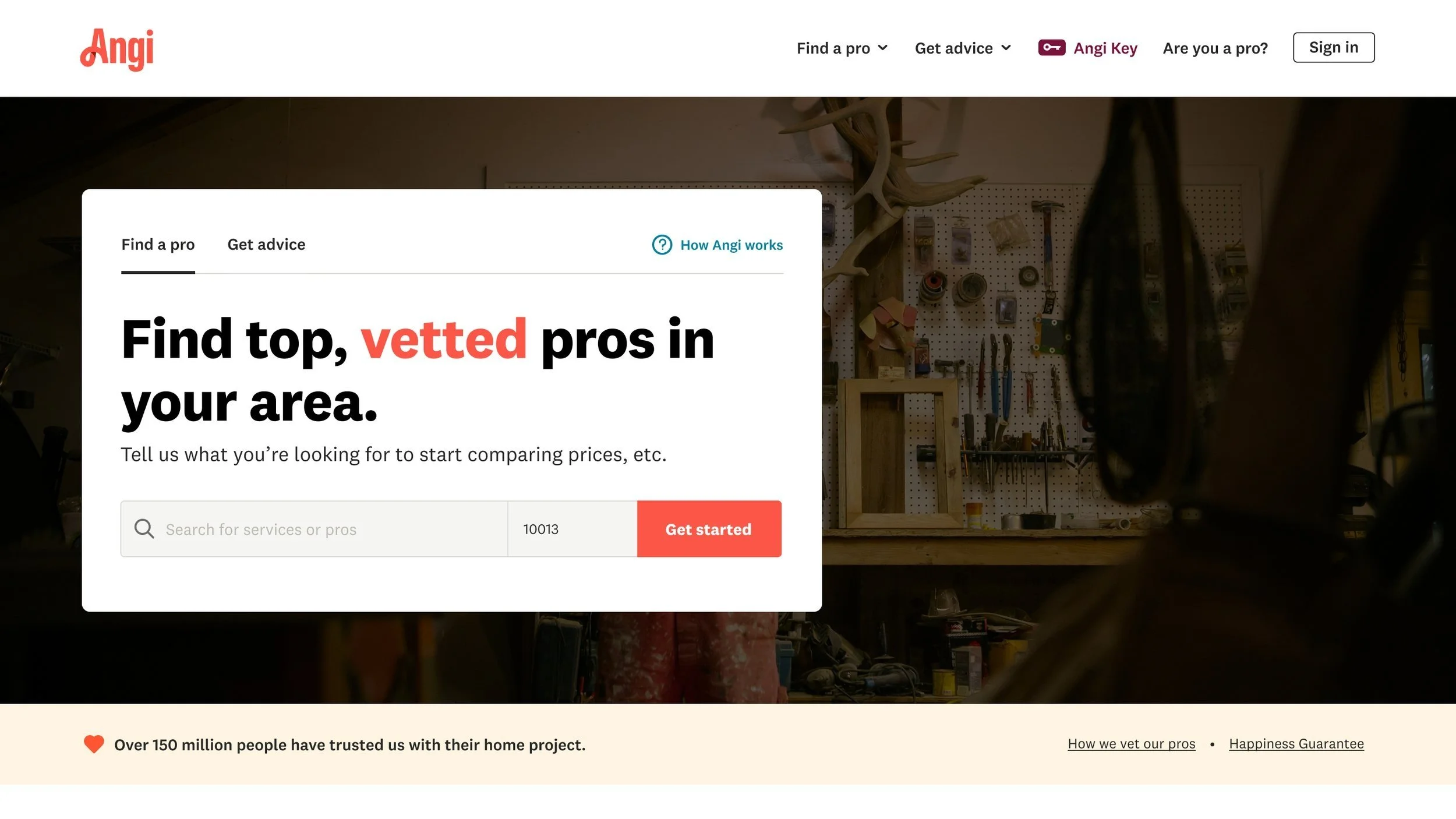
Latest design
> Background
In 2017, Angie’s List was acquired by IAC and merged with HomeAdvisor. In March 2021, we set out to rebrand Angie’s List to Angi. The homepage has gone through a lot of change since then, mostly in response to a huge drop in conversion and increase in bounce rate that we noticed late 2021.
When I joined the team, my initial focus was to support pre-defined tests, help come up with new tests to right size our numbers and eventually explore the future vision.
After a couple weeks and a couple tests, it became clear that we needed to have a better holistic strategy and vision for the homepage, sooner rather than later, so we could take bigger, more calculated and strategic swings.
> Understand
The first step for me was understanding everything homepage. From what our users think, to what the business needs were, to what stakeholders wanted, what our competitors did and what the data said.
ONE KEY LEARNING
Users didn’t understand how to search for the project they were looking for.
> Strategy
While I worked on understanding what we needed, what our users think and what the data says, I also wanted to clearly define our goals, and metrics for success to rally the team around.
Our primary goals were to:
Drive more users to start a project
Drive more engagement
Educate users on how they can start a project
(Re)build trust and love in the new Angi brand
> Process
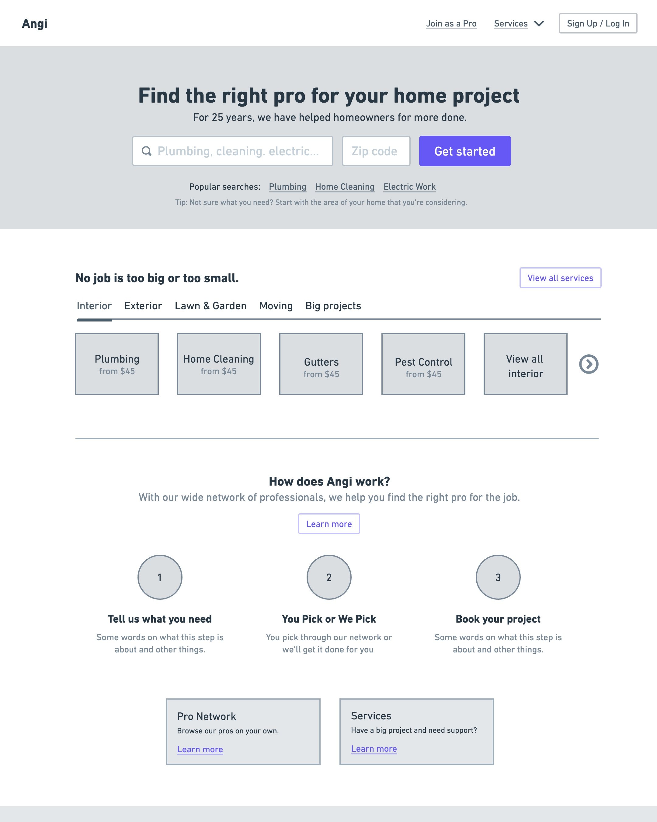
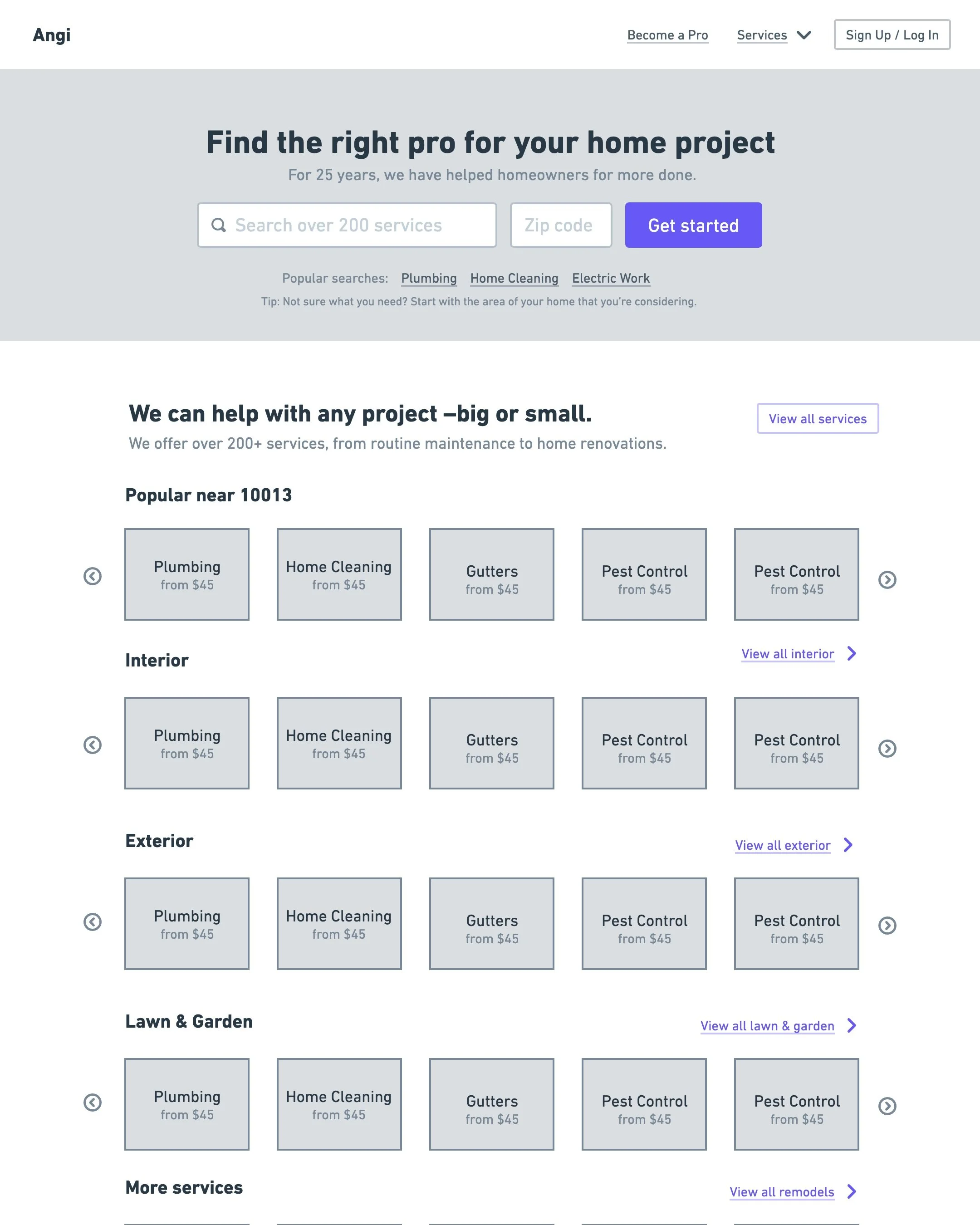
First, I took a stab at determining the content strategy through wireframes and collaborating with the copy team. Things I wanted to work through were:
If finding a pro is the main reason someone if visiting Angi, how do make it make easy for them to jump right in?
How do you provide different ways, beyond search, for a user to find what they’re looking for?
How do you share the breadth of what Angi has to offer and how Angi works in the simplest way?

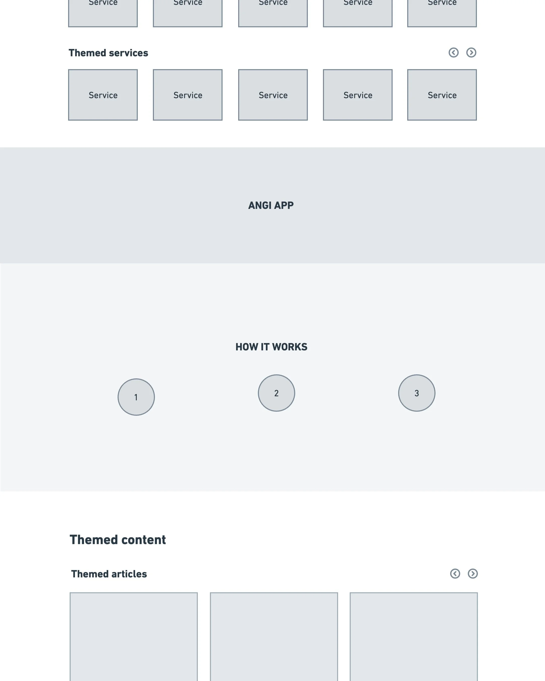
> Iterations
I explored a few directions before I settled on two directions that felt promising enough to bring to design crit for feedback.The first option offered many different ways for a user to discover services at any point throughout the page while the second option gave more real estate diving deeper into certain areas.


> Visual Design
Using the wireframes from the first option and the content strategy, I explored a few options for how this could take shape. Throughout this process, I also drew inspiration from homepages of other companies that I liked such as Sweeten, TripAdvisor, Uber and Airbnb.
> Result
I sent over a video walkthrough to the latest round of designs for key stakeholders to review and provide feedback. So far, it’s been extremely positive so I’m excited about the progress we’ve made.
Unfortunately the project was put on pause as part of a re-org.


> Core Team
PRODUCT DESIGNER
Kim
PRODUCT MANAGER(S)
Robert + Adam
ENGINEER(S)
Sean + Chase
> XFN Team
CONTENT & SEO
Allison, Sharanya
RESEARCH & DATA
Sammie, Kevaun
MARKETING & BRAND & COPY
Diana, Katie, Neil